
Sam Hallas' Website
Optical Character recognition is like an electronic copy typist. It can scan a document or use an already scanned image, 'read' the text and output it as a word processor document. Pretty obviously, it's only good for documents that are mostly text.
I use a program called TextBridge Pro, but there are plenty on the market and most scanners come with some sort of OCR software.
I'll show how I converted the Loudspeaking Telephone No4 User Instructions as I go through the steps involved.
Once the software is running the first step is to scan the document or import a file. I had to experiment to find the best mode for scanning. With white paper the Black and White mode seems best, but with coloured papers - especially blue - greyscale seems to be more accurate. Coloured text on coloured paper needs some experimentation.

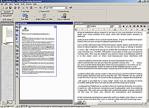
Once the document is scanned I need to select the area used for character recognition, or let the program work it out for itself. I usually mark out the areas, particularly on documents with a mixture of text and diagrams.
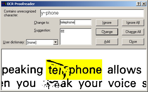
Then I start the OCR process. When the program finds something it can't recognise, or often words that are not in its dictionary, it asks for a correction. The more corrections there are the more it's struggling. If there are a lot I tend to try a different mode of scanning.
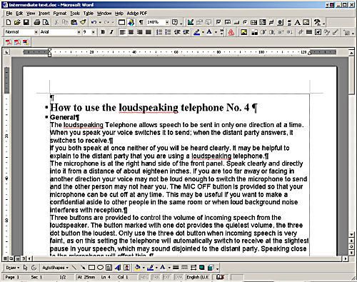
The recognised text appears in the right hand pane. The program formats text ready for use in a word processor, like Microsoft Word, but it seldom does it right.
After that I only have to copy the text to the clipboard. I paste the text into a plain text editor, like Notepad and recopy it before pasting into Word.
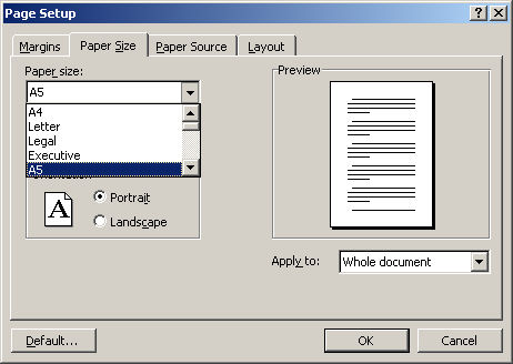
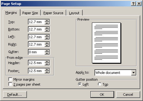
This is the tricky bit if the reconstructed document is to look as much like the original as possible. The first thing I need to set is the paper size. Fortunately the User Instructions are standard size - A5.
Next I set the page margins to be approximately the same as the original so that the page layout and boudaries will be similar. I can measure this with a rule, but here I guessed at half an inch (12.7 mm)
Accurately matching the typeface is not a priority. I'm not making a forgery of the document, only a reasonable facsimile. I also need to remember that if someone else is printing it, they may not have Bodoni Ultra Light or whatever typeface I choose, making the exercise pointless. In most cases it's sufficient to choose a proportional or fixed width face and decide whether to use serif or sans-serif.
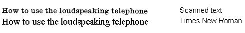
The Use Instructions are an easy choice. The headline is evidently a Times Roman look-alike
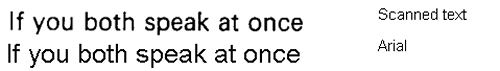
and the body text is a sans-serif similar to Helvetica or Arial.
Now I paste the text into the empty document.
Set the typefaces I chose and adjust the sizes.
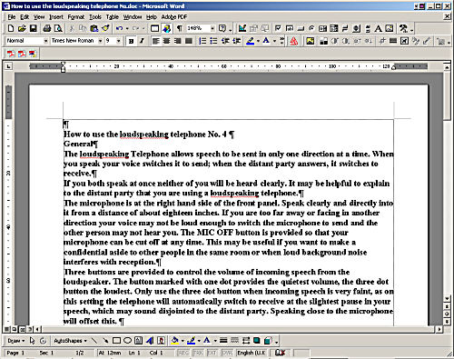
Pop in the logo at the top, tweak the type size to roughly match the line breaks on the original and set the line spacing to suit, embolden the text where needed - and the facsimile is complete!
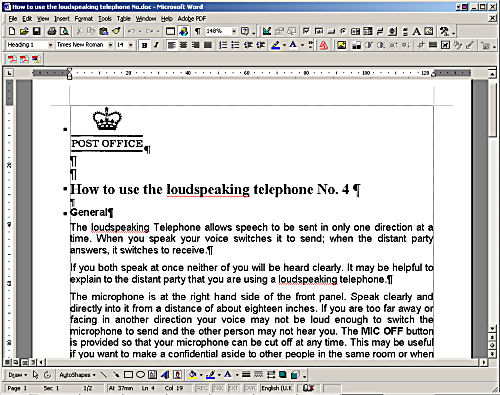
You can check the complete document in Acrobat® format. Spot the difference! And the file size? A paltry 16 kB.
Document Repository